The Matching-Color Trap in Travel Photography
Matching color in travel photography can make a place feel staged. Learn when to keep clashing hues so your images retain the scene’s character.
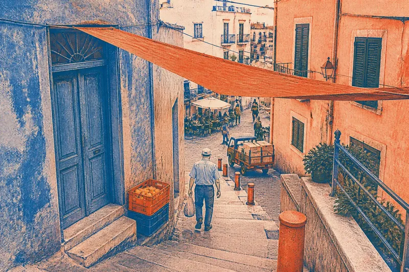
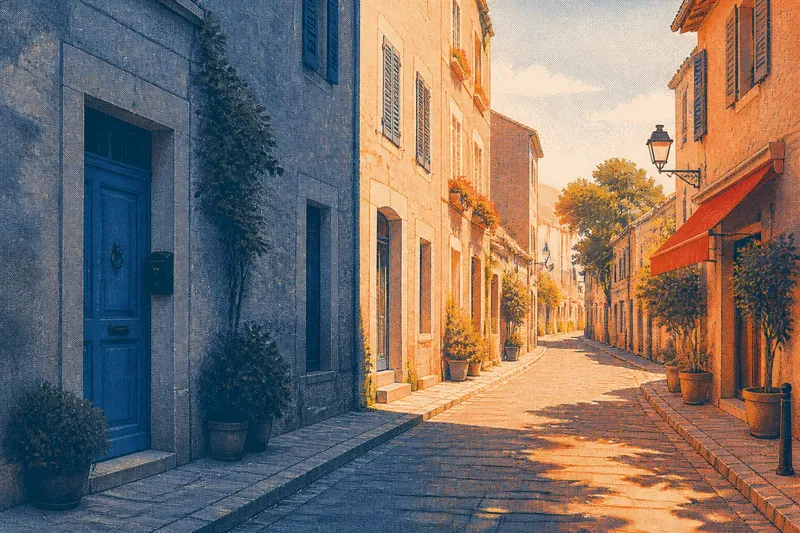
The common mistake in matching color in travel photography is treating every stray hue as a problem to correct. A blue awning beside a rust-red wall, or a green plastic chair under warm café lights, can look untidy on a screen. Remove those contrasts, though, and the picture may lose the detail that made the street feel like itself.
A tidy palette is useful when it follows the scene. It becomes a trap when it dictates what the scene is allowed to contain. These field notes are about deciding which colors belong in the frame, which can be managed with composition, and which are better left alone.
Look Before Correcting
Color is often the first thing a photographer tries to settle after taking a picture. A quick adjustment to warmth, saturation, or tint can make the frame feel more coherent. It can also turn distinct surfaces into one agreeable wash.
Before editing, name the colors you remember from standing there. Not the colors that look attractive in the camera preview: the ones that made the place recognizable. Perhaps it was a faded pink storefront, a row of orange bollards, and a gray sky. If the file now makes all three look muted and compatible, the edit may be smoothing away useful evidence.
That evidence need not be grand. A bright crate beside a stone doorway can say as much about a working street as the doorway itself. The crate may be visually inconvenient. It may also be the thing that keeps the photograph from reading as a brochure for stonework.
Contrast Carries Place
Travel scenes acquire their particular character from things that were not selected to match. Painted shutters, road markings, market tarps, café signs, laundry, and temporary barriers share space because they serve different purposes. Their colors can meet without forming a palette, which is often the point.
Look at the edges where those uses overlap. A turquoise sign may sit against an ocher wall; a red delivery cart may cross a pale plaza. The contrast establishes scale, activity, or local habit. If every color is subdued until it agrees with the architecture, those relationships become harder to read.
This does not mean every vivid object deserves equal prominence. A bright object can dominate because it is large, close to the lens, or placed near the center. The choice is not simply “keep the color” or “remove it.” Consider whether a small change in viewpoint can let the color remain while reducing its command over the frame.
Imagine you are photographing a narrow lane where a lemon-yellow rain cover cuts across a weathered blue doorway. If the cover blocks the doorway’s handle, you could shift to the side until the two forms separate, keeping both colors visible and making the entrance legible. The result should read as a lane with a practical, slightly unruly detail, rather than a doorway decorated for the camera.
Frame the Disagreement
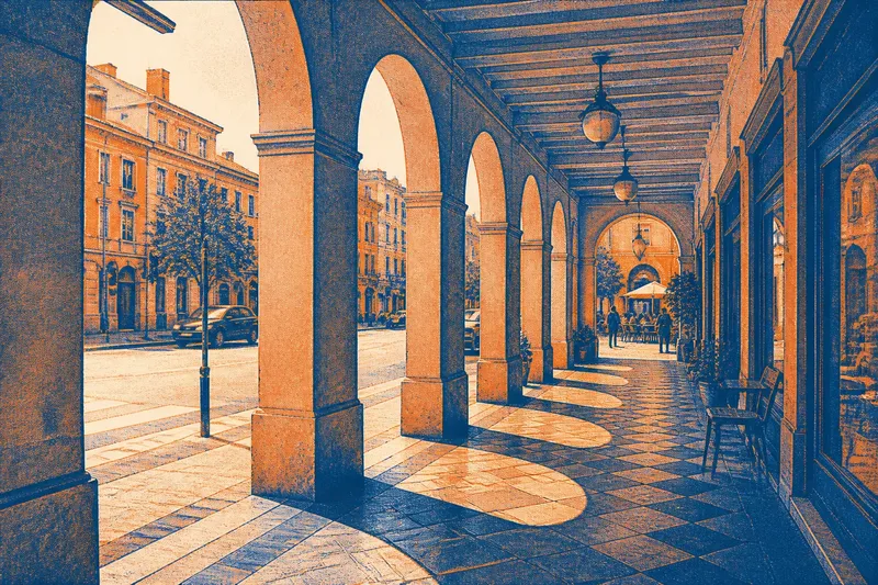
Composition can make clashing colors feel intentional without making them harmonious. Put the competing colors in clear relation: let one occupy a broad surface and the other appear as a distinct accent, or use a doorway, curb, or shadow line to keep them from merging. The scene can remain visually unsettled while the picture stays easy to read.
Distance changes the balance. From close up, a scarlet awning may overwhelm a small patch of limestone. Step back, and the awning becomes one element among balconies, pavement, and people. Conversely, moving closer can isolate a color pairing that would otherwise disappear into a busy street.
Try a slight change in camera height as well. A low viewpoint may stack a green railing over a white wall; standing higher could separate the bands and reveal the painted doors behind them. No palette adjustment can repair an overlap that begins with the wrong angle.
Watch the background around a colorful object. A red sign against a pale wall is easy to identify; the same sign tangled with a red jacket, a brake light, and a banner may become a patch of visual noise. A small shift that separates those shapes may help more than reducing saturation across the whole frame.
Choose What Stays?
Should I remove a bright object?
Ask what the object contributes before deciding. If it records how the place is used, its color may belong even when it interrupts a quiet composition; if it is a passing distraction that obscures the subject, try a new frame before reaching for a removal tool.
How much saturation is too much?
There is no setting that suits every scene, so compare the edited image with what you recall and with the unedited file. If paint, fabric, or pavement begins to look luminous in a way it did not outdoors, ease the adjustment back.
Can clashing colors still feel calm?
Yes, when the frame gives them space and a clear order. A small vivid detail against broad, quieter surfaces can remain a contrast without making the entire picture feel loud.
Should I use a preset?
A preset can provide a starting point, but it may push unrelated colors toward the same look. Check specific surfaces afterward, especially painted walls, skin, signs, and foliage, and keep the parts that still resemble the scene.
Edit Without Flattening
When editing, begin with broad corrections that address the file rather than the scene’s character. If the whole image is too warm or too cool, adjust the overall white balance modestly. Then look at the competing colors again. A global change affects them all, even if only one was bothering you.
Selective color controls can help when one hue has become distracting, but they are easy to overuse. Lowering the saturation of every red may drain a sign, a coat, and a painted door at once. If your software offers masks or local adjustments, use them narrowly and inspect the edges for halos or unnatural shifts.
Keep an unedited copy nearby, or use the editor’s before-and-after view. The comparison is not a contest to preserve the original at all costs. It is a way to notice when a neat edit has started to erase differences between materials: brick and painted metal, leaf and plastic, sunlit plaster and faded fabric.
Color can also look different across displays and under different viewing conditions. Avoid making a strong correction based on a dim screen in a brightly lit room. Check the image again in ordinary viewing light before deciding that a difficult hue needs a more forceful fix.
Know What to Ignore
Not every mismatch needs a theory. Sometimes a passing bus, a bright umbrella, or a strip of tape simply breaks the frame. If waiting a moment or shifting a pace clears it, do that. If the detail stays and the photograph still describes the place, it may be more honest to leave it in than to spend a long edit chasing visual tidiness.
What is not worth the effort: making every color in a travel set share one exact mood. A port, a covered market, and a residential courtyard do not owe one another the same palette. Consistent processing can make images feel related, but consistency does not require every blue to match every other blue.
Also resist correcting a color just because it looks unfamiliar beside its neighbors. A painted door can be startling against a muted facade and still be the right color. If the hue seems implausible, compare it with the scene you saw and check the display before making a local correction.
Keep the Useful Clash
The best question is not whether the colors coordinate. Ask whether their relationship helps you recognize the scene: its materials, uses, and small collisions. A photograph can be orderly in its framing and unruly in its color. Those qualities are not in conflict.
When matching color in travel photography, keep the contrast that carries information and change the frame when an overlap obscures it. A stray hue may be the detail that makes a place feel observed rather than arranged. Let it stay if it earns its place.